Beautiful Georgia Homes
Based in Georgia, USA, this real estate firm faced a critical disconnect: its visual identity did not reflect the high value of its property listings.
I executed a full strategic rebrand to elevate their market positioning.
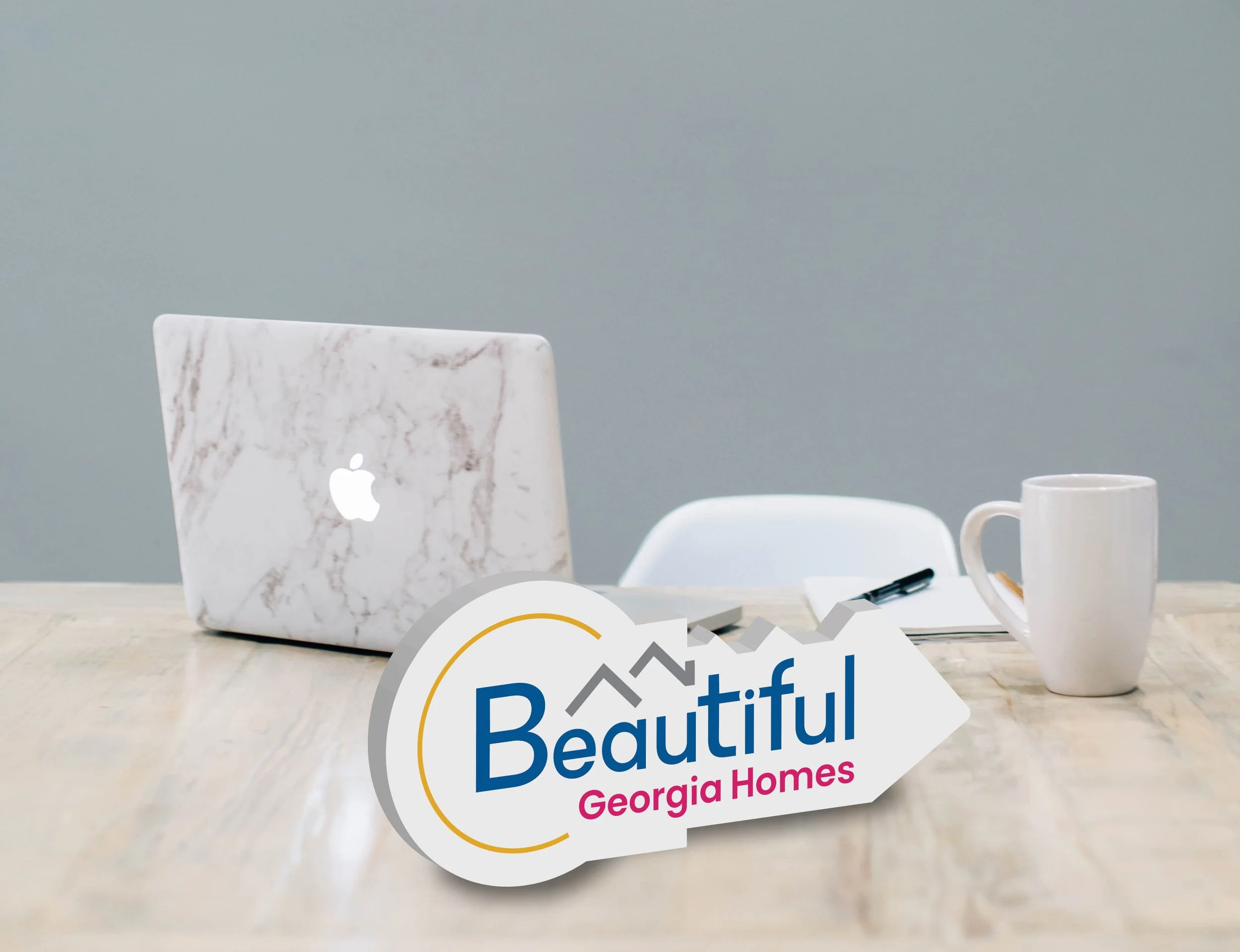
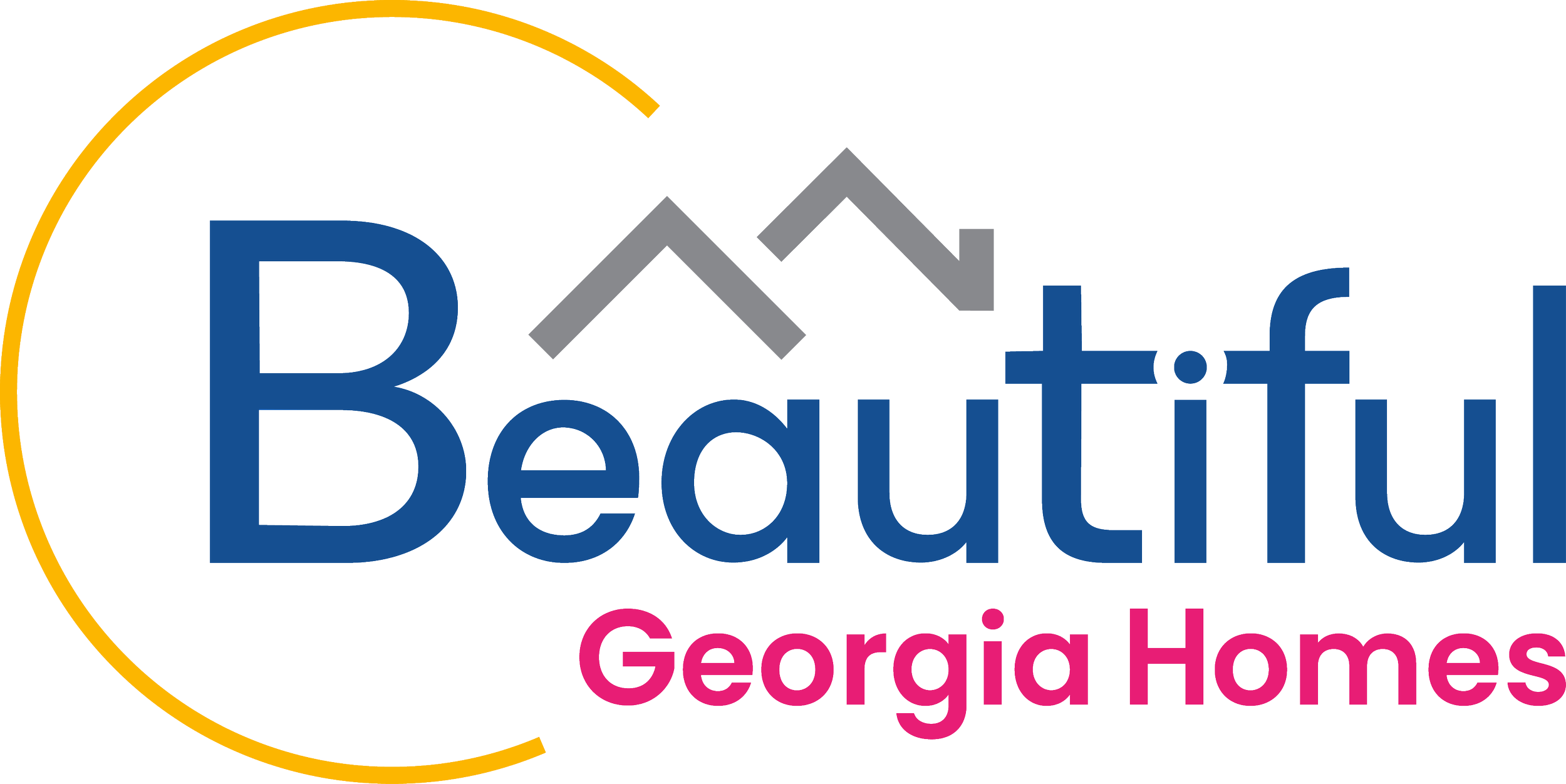
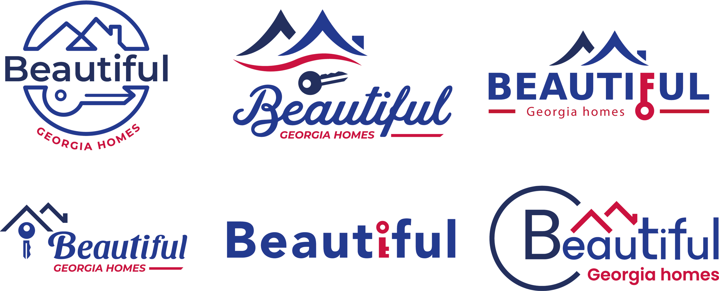
Concept: A clever integration of form and function. The new logo forms the silhouette of a house key, where the “teeth” are shaped like residential rooflines and the “bow” (handle) depicts a rising sun—symbolizing new beginnings and warm hospitality.
Typography: The company name serves as the body of the key, grounding the symbol in the brand’s identity.
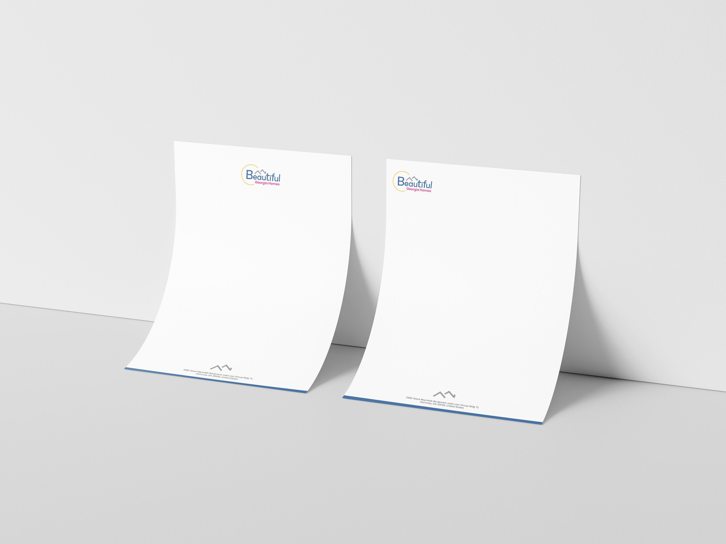
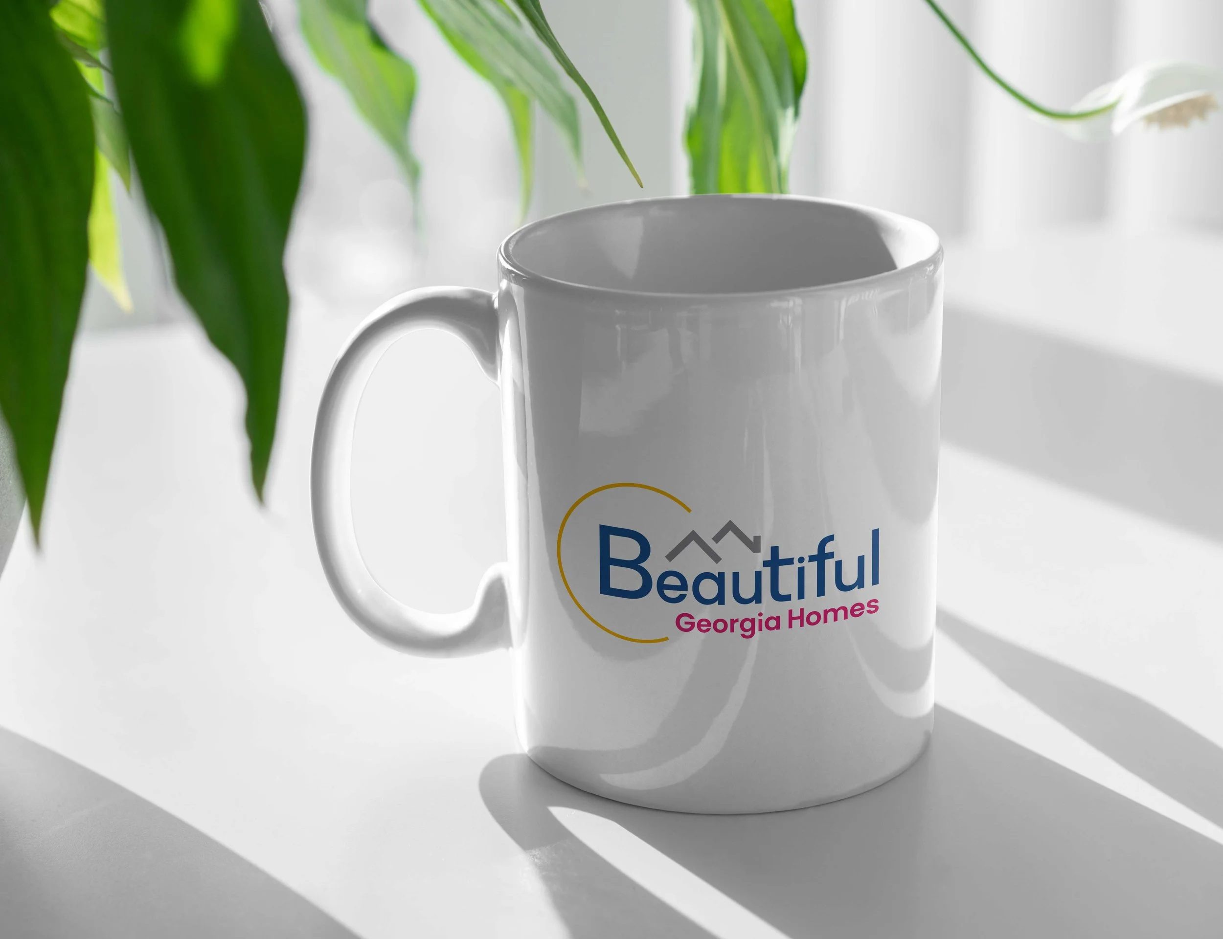
The rebrand successfully transitioned the business from a generic service to a cohesive brand. We replaced a standalone logo with a comprehensive visual identity system that now seamlessly aligns their premium service quality with customer perception across all touchpoints.

THE DRAFTS
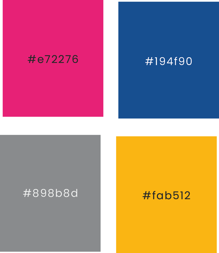
THE cOLOR
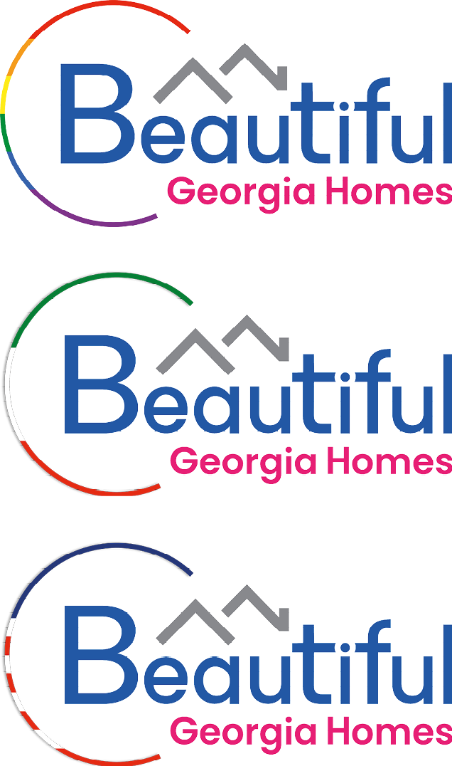
THE VERSIONS
THE texture

THE mockups